
Development
Apple iPhone Duo review: Two screens, two experiences, two thousand dollars
October 27, 2026 Development Source: Ars Technica
Share this article



For the first day or two, I found this pretty off-putting. I kept losing track of the iPad-style button-mounted Touch ID sensor and flipping the phone around with the camera upside down. When fully opened, the phone acts like an iPad: It’s orientation-agnostic, and it will work in portrait or landscape, regardless of which end is up. But in its folded one-handed mode, the Duo still has a right-side-up and an upside-down just like any iPhone, and it took a couple of days of retraining my muscle memory before I was consistently pulling it out of my pocket and looking at it the right way without thinking about it.
When folded up, the iPhone Duo has a more compact footprint than Apple’s other phones and a screen that’s both shorter and wider. The titanium frame looks and feels a lot like last year’s iPhone Air, which plenty of people (us included) pegged as a half-step toward a foldable design. The outer screen looks and feels like a typical glassy iPhone screen, and the “back” of the phone where the camera is (the only quadrant of the phone that isn’t a screen) uses familiar-looking and -feeling Ceramic Shield glass.
The Duo’s other physical button is the Camera Control button. I would vastly prefer it be a customizable Action Button, which I use constantly on my iPhone 17 Pro. For a phone with this many acres of edge, it feels like the Action Button should have room to exist somewhere, but it doesn’t.
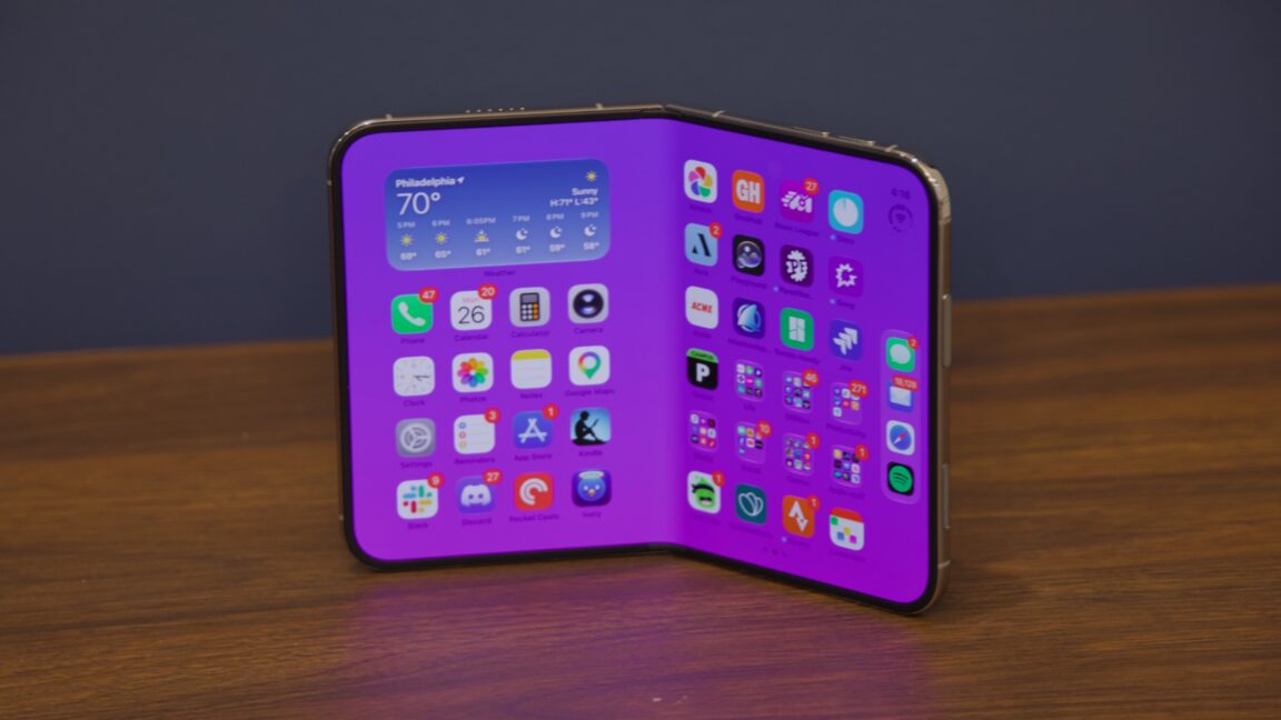
That shorter, wider screen leads to the biggest and most noticeable of the iPhone Duo’s software design changes, at least in folded-phone mode: Your dock moves to the right edge of the screen, and that’s where most app controls move, too. Controls for apps that normally appear on the top or the bottom of the screen are now generally relocated to the right side of the screen, which is still something I’m still getting used to, even after nearly a week of daily use.
These side-mounted controls feel like they’re swimming upstream against almost two decades of smartphone app design—and they don’t even really solve the “lack of vertical space” problem because as soon as the iOS keyboard pops up, the viewable area still shrinks to just a few lines of text.
This right-hand navigation area also feels weirdly underutilized, given the percentage of the front screen it takes up. Your dock is there, but Apple still limits it to four icons, leaving a ton of unused space above and below it. The nav area feels too wide, with too much negative space.
In the end, I only really liked the Duo in folded-down phone mode when it was sitting on a desk, couch, or table next to my laptop, serving as a separate compact notification screen—in other words, when I was not actively holding or touching it. And this isn’t something no other phone can do; it’s just a regular phone thing that the Duo doesn’t make worse.
Frankly, I’m much more bothered by the under-screen camera, which is visible pretty much constantly. The seam is visible from some angles if you go looking for them. The under-screen camera pinhole is only invisible from some angles if you go looking for it. It’s out of the way enough not to be experience-ruining, but I did find it distracting, and I don’t know that I find it to be a net improvement over the actual-pinhole-with-Dynamic-Island solution that Apple has used for the last few iPhone generations.
When unfolded, the Duo’s screen expands from a squat 5.4 inches to a more comfortable 7.6 inches, which isn’t so far off from the new iPad mini’s 8.5-inch screen. The dock is still limited to four app icons, like a regular iPhone, but it moves back to a familiar place at the bottom of the screen, and apps have more room to breathe.
In landscape, apps usually retain the same side-mounted controls you see on the phone’s front screen, but when you pivot to portrait mode, they revert to more familiar positioning at the top and bottom of the screen—portrait mode looks pretty much like an iPad, while landscape mode looks more like a pair of iPhone home screens next to each other (more on that in a minute).
The inner screen has a matte nano-texture finish, which shares a name with the technology used in some Macs and iPads. But Apple says that both the materials used and the actual nano-texture pattern are both different, changes that were necessitated by the fact that this is a foldable phone and not an inert glass slab. A slightly raised rim around the edge of the screen keeps it from resting directly on a table or desk and leaves room for tiny bits of dust or crud to get trapped without grinding into the screen. If the inner screen does get damaged, this cover layer can apparently be removed and replaced without too much trouble.
The hardware’s design makes sense when you look at multitasking mode. Half of an unfolded iPhone Duo is exactly the same as using the iPhone Duo in its folded-down phone mode. The side-nav is pinned to the left side of the screen instead of the right side, but it otherwise feels very similar to having a pair of iPhones you can use in tandem (I would say “two iPhones for the price of one,” but that doesn’t work when the base Duo model is even more expensive than buying two regular iPhones).
Third-party apps need to be updated in one way or another to support the Duo, with baseline support granted at least partly for “free” to apps that target the Xcode 27.1 SDK. Apps that haven’t been updated look mostly OK on the outer screen, since its strip of usable space is roughly the same width as a regular iPhone. Apps that haven’t been updated look like iPhone apps running on an iPad when the screen is unfolded, though: little phone-sized windows with black borders all around, with an option to expand them so they take up the entire screen.
I’ve been surprised how many apps have added Duo support in the few days since the device came out, given that Apple didn’t even make these tools available to developers until just a few weeks ago. But early adopters will run into tons of apps that don’t know what to make of the Duo’s larger inner screen, and I suspect it will be a while before you can assume that any given app will work properly on it.
Not all apps that support the Duo do different things in every one of its modes, but apps can treat them all as their own unique views if they want to. (I asked a developer from the New York Times Cooking team at an Apple-hosted developer showcase how many distinct views they needed to support to cover every possible position that an app can appear in on the Duo. “Seven. It’s seven,” he replied without hesitation.)
The Apple A20 Pro is Apple’s first 2 nm phone chip, and its second 2 nm chip overall after the M6 that debuted in the new Mac mini. It still uses two large CPU cores and four efficiency cores, the same as the last few generations of A-series chips, but it’s the first phone chip to include “super” cores instead of performance cores. Unlike the M6, which ships all three kinds of cores, the A20 Pro just uses super and efficiency cores.
What keeps me away from the standard iPhone these days is that I find the ultrawide lens to be by far the least useful one Apple ships and the telephoto lens to be the most useful. The Duo’s camera asks you to make the same kind of downgrade from a Pro iPhone, though it at least improves on the one-camera setups Apple ships in the iPhone 17e and iPhone Air.
Once you get past the lack of a telephoto lens, the Duo’s camera system is perfectly competent. Apple’s year-to-year camera quality improvements generally happen around the margins—a little less noise here, a little better low-light performance there—and that’s what I observed while comparing it to my iPhone 17 Pro. To my eye, the differences between the 17 Pro and Duo in good lighting were minimal, but the Duo did capture marginally better detail in low light (see the cat pictures). Of course, when you try comparing the Duo’s digitally zoomed 4x and 8x photos to the 17 Pro’s telephoto lens, there’s zero contest.
That the inner camera is so much worse than the outer camera is made even more obvious by the fact that the inner screen is twice as large; when you fire up a FaceTime call, you’re looking at a lower-resolution image on a larger screen. This isn’t a dealbreaker; the bi-directional FaceTime call that shows the person on the other end of the line on both the outer and inner screens remains genuinely cool, even with the potato-esque quality of the inner camera. But it’s yet another place where the core/traditional iPhone experience is degraded to make room for the Duo’s hero features.
I see the promise of the Duo. It feels well-built—some users have had problems with screen breakage, but it’s not something we ran into. Its hardware and software are cleverly designed. It mostly solves the visible-seam problem that most Android foldables come with. An updated version of the Duo with Face ID support would be just about the best possible version of this form factor, given the limits of battery technology and physics. But for me personally—and for many happy iPhone users—it requires too many compromises to enable features I don’t want badly enough.