Development
Popular navigation apps unlikely to ditch Mercator maps despite UN resolution
September 9, 2026 Development Source: Ars Technica
Share this article



Nearly every country represented in the United Nations General Assembly recently voted in favor of promoting world maps that more accurately show the size of various continents. But the UN resolution is unlikely to change how millions of people regularly see versions of 16th-century Mercator maps depicting skewed continent sizes in navigation apps.
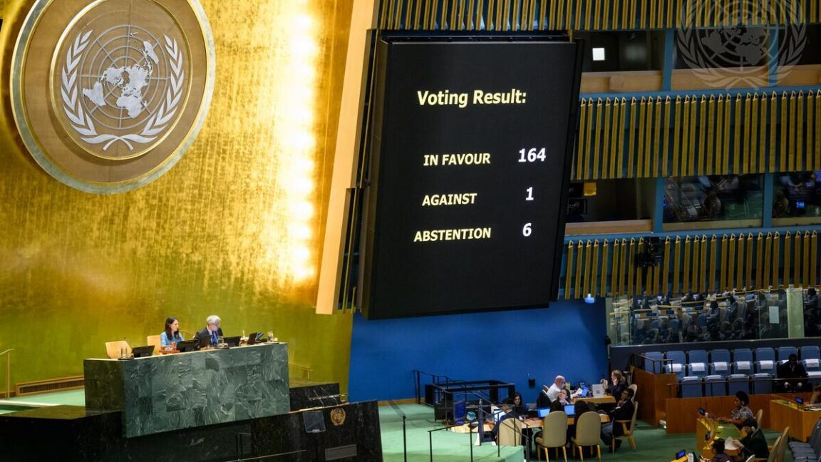
On September 4, the African-led resolution attracted 164 votes in favor, with six countries abstaining from voting. Only the United States voted to oppose the resolution after describing it as a “radical ideological project,” according to UN News.
The non-binding UN resolution does not impose map changes on anyone. Instead, it “encourages governments, schools, international organizations, and technology companies to use the Equal Earth projection and other so-called equal-area maps when relative size matters,” UN News reported. The resolution also encourages teaching about the trade-offs that arise from depicting a spherical planet on a flat map.
Many popular world maps often represent modernized versions of the Mercator world map originally developed by Flemish cartographer Gerardus Mercator in 1569. His focus was on creating a map projection that showed straight lines consistent with how ships might move when consistently following a compass bearing, making it a very practical maritime navigation tool for plotting accurate courses at sea.
The practicality of the Mercator projection for navigation helped it become one of the most popular world maps still in use today, and digital maps are no exception. The most widely used navigation apps, such as Google Maps and Apple Maps, still use variations of the Mercator projection, with Google Maps alone having more than 2 billion monthly users.
However, the Mercator map comes with the trade-off of showing inaccurate sizes for continents. Landmasses become artificially enlarged the farther they are from the Earth’s equator, which leads to absurdities such as the continent of Africa appearing to be the same size as Greenland despite being 14 times bigger.
The visually inflated size of certain landmasses such as Greenland on the Mercator map may even have geopolitical implications. A study published in Communication Reports found that national security arguments paired with the Mercator map could influence how people evaluated the Trump administration’s proposal to purchase Greenland.
By comparison, the Equal Earth map projection was developed in 2018 to accurately represent the size of landmasses at the expense of distorting their shapes. Bojan Šavrič, Bernhard Jenny, and Tom Patterson created the Equal Earth map in response to cartographic controversy over the Boston Public Schools’ 2017 decision to use a Galls-Peters projection for world maps. The latter provides more proportional landmasses but greatly distorts shapes near the polar regions.
There is value in clarifying public perceptions about how each map distorts reality. A study of 130,000 people found that people more familiar with the Robinson map projection—a compromise between equal-area representation and accurate preservation of small-area shapes and angles—estimated the size of countries, regions, and continents more accurately on average than people who had greater familiarity with the Mercator map projection.
“This result emphasizes the need to use less area-distorted map projections in, for example, (social) media and in educational materials,” the researchers wrote in their paper published in the ISPRS International Journal of Geo-Information.
The most famous illustration of how the Mercator map projection distorts Africa’s true size comes from German software designer Kai Krause. In 2010, he developed a visualization called “The True Size of Africa” showing how the African continent could encompass the United States, China, India, Japan, and practically all of Europe.
Inspired by Kai Krause’s infographic, James Talmage and Damon Maneice created “The True Size Of…” website that shows how the Mercator projection distorts the size of different countries as they’re dragged around on the map. They also took inspiration from an episode of The West Wing that featured a discussion of Mercator map bias involving the fictional Organization of Cartographers for Social Equality
Some governments and schools may take their cue from the UN resolution to promote more educational use of the Equal Earth map projection. But that won’t change the fact that millions of people will continue regularly consulting navigation apps like Google Maps that feature the Mercator map projection. The latter’s practical usefulness was acknowledged even by the UN resolution’s backers.
Of course, the best way to view the world’s continents and other landmasses with the correct shapes and sizes is to look at a physical 3D representation of the world’s globe—or to interact with Google Earth’s digital depiction of the world that includes satellite imagery and 3D representations of buildings and terrain.